April 22, 2013

PANTONE: Fashion Colour Report (Men/Women Fall 2013)


Pantone LLC, an X-Rite company and the global authority on colour and provider of professional colour standards for the design industries, announced PANTONE® Fashion Color Report Fall 2013, a comprehensive overview of designers’ use of colour in their upcoming collections. 

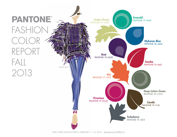
Released on the first day of New York Fashion Week, the PANTONE Fashion Color Report features the top 10 colors for women’s and men’s fashion for fall 2013, along with designer sketches, quotes and headshots. 

The report is available for free download at www.pantone.com/fall2013.


Women’s Colour Palette

This season, designers express the many moods of fall with skillfully arranged collections that will enhance and enliven customers’ outlooks as the colder months set in. Similarly, colors come together to create moods that range from sophisticated and structured to lively and vivid, encapsulating our inherent need for wardrobe variety to reflect emotions that run from thoughtfully introspective to irrepressibly related. With the changing season, the greens from spring evolve and develop. 


Multifaceted Emerald continues to sparkle and fascinate, bringing luxury and elegance to the palette, while yellow-toned Linden Green brings a lightness and brightness to the deeper shades of fall. Try pairing both with Mykonos Blue, a bold, meditative blue, for a classic and relaxed fall look.

Exotic Acai adds mystery and richness to the palette, and can be incorporated with the other colors to create a number of powerful fall combinations. Pair the elegant shade of purple with Emerald for a regal disposition, or spirited Samba red for an expressive and dramatic look. Koi, a decorative orange with dazzling and shimmering qualities, is a statement color that serves as a pick-me-up for your wardrobe. Vivacious, an unruly and wildly deep fuchsia, adds an ebullient sensuality to the palette.

Pair Vivacious with anchoring Deep Lichen Green, a naturally lush shade of green, for a dynamic juxtaposition that captures both ends of the seasonal spectrum. Rounding out this season’s cornerstone colors, Turbulence, a dark mercurial gray, and Carafe, a rich, glamorous brown, provide more interesting and sophisticated alternatives to the black basics usually worn in colder months. Both staple neutrals pair gracefully with more expressive colors within the palette, such as Samba, Koi and Vivacious.
The top colors for women’s fashion for fall 2013 are:


PANTONE 17-5641 Emerald


PANTONE 18-4434 Mykonos Blue

PANTONE 15-0533 Linden Green

PANTONE 19-3628 Acai
PANTONE 19-1662 Samba
PANTONE 17-1452 Koi
PANTONE 18-0312 Deep Lichen Green
PANTONE 19-2045 Vivacious
PANTONE 19-4215 Turbulence
PANTONE 19-1116 Carafe


Men’s Colour Palette


This season, more than ever, there is a shift towards a unisex color palette. Similar to the women’s palette, the versatility of the men’s colors for fall allows for more experimentation as the weather cools.


Luxurious Emerald, a sophisticated and vivid green, should be paired with Mykonos Blue or Linden Green for a clean and classic look. Acai adds exotic mystery when paired with bold statement colors like Samba, while Koi remains decorative and dynamic, adding a pop of orange to a neutral wardrobe. Deep Lichen Green acts as the cornerstone color for the men’s palette as well; however, pair the shaded mossy green with Beaujolais, a full-bodied red, for an elegantly masculine, quintessential fall look.

Unpredictable Turbulence and warm, rich Carafe, also play vital roles in men’s fashion trends, serving as strong staple hues for outerwear throughout the cooler months. Create a well-balanced look by combining either neutral with Beaujolais or Koi.


The top colors for men’s fashion for fall 2013 are:

PANTONE 17-5641 Emerald
PANTONE 18-4434 Mykonos Blue

PANTONE 15-0533 Linden Green

PANTONE 19-3628 Acai
PANTONE 19-1662 Samba
PANTONE 17-1452 Koi
PANTONE 18-0312 Deep Lichen Green
PANTONE 18-2027 Beaujolais
PANTONE 19-4215 Turbulence
PANTONE 19-1116 Carafe


The colors featured in the PANTONE Fashion Color Report are culled from the PANTONE FASHION + HOME Color System, the most widely used and recognized color standards system in the world. Each season, Pantone surveys the designers of New York Fashion Week and beyond to collect feedback on prominent collection colours, colour inspiration and color philosophy. 

This information is used to create the PANTONE Fashion Colour Report, which serves as a reference tool throughout the year for fashion enthusiasts, reporters and retailers. 


Courtesy of PANTONE 
https://www.pantone.com/pages/MYP_mypantone/mypInfo.aspx?ca=75&pg=21103


March 20, 2013

POP-YA-COLOUR: Itumeleng 'Mercia' Matlhaku (Interview)


PART 2: The Interview

I had the privillige to do the press coverage for a NWSD shoot & once again we had a successful fashion photo shoot featuring NORTH WEST SCHOOL OF DESIGN Graduate, designer...

 Itumeleng Mercia Matlhaku 
from Deep Moon Fashion Emporium


The Questions:

K: Tell me a little about yourself. Where are you from? What's your educational background? What are your general professional and non-professional interests?


M: "I'm vibrant person yet an introvert at the same time, when it comes to other personal things I become very private but When it comes to work and my life as a designer then what you see is what you get, I am a type of person who shoot straight from the hip, I'm from MAFIKENG but I grew up in different places, I was born and bred in the North West, after Matric I studied Clothing design and technology with North west school of design and currently studding BA Communication science with UNISA.

K: What was the first article of clothing you ever designed?

M: The very first article of my designed clothing was with TRUE LOVE MAGAZINE 2004.it was for ethnic chic! The fashion editor gave me two full pages and it was worth 60 000 and the response was profound! It gave me a break because it happened right after I opened a bigger studio in Johannesburg fashion district.


K: What do you believe makes a quality article of clothing?

M: When an article sell a designer/store attract the readers and covers a relevant line for its readers; it is explanatory and has all the necessary info like contacts.

K: What's your favourite part about conceptualizing a design?

M: The very first part! Gathering information about the design, what, who, where, when and how, immediately in my head a picture emerges and makes the next step of garment illustration very pleasurable!

K: What advice do you have for aspiring fashion designers?

M: Being a designer is not easy! You have to work twice as hard to make it in this industry! You must be self-motivated, driven and have perseverance .It is basically a field for hard workers and go-getters; there is absolutely no time for excuses."

K: How would you define your personal style?

M: Funky and...depending on my mood, there are days when I can compromise sophistication for class. But personally I am what they call an evangelist for iskhothane (obsessed fashionistas). I always rock high fashion garments hairstyle and shoes. I’m a sucker for style. If I had my way everything I do or about me would be stylish, from my kids, the house I live in to the car I drive depending on my mood.

K: How would you define the style your line exemplifies?

M: With this collection I was bidding farewell to color block and unarranged full colour, it’s a no relation collection! The garments a totally not sisters to one another, they dont come from same concept or fabric!

K: Where do you get your inspiration?

M: People inspire me! Their characters, moods, attitude, love, hatred, envy, jealousy, body sizes and shapes. I believe PEOPLE ARE LIFE! THEY MAKE LIFE! Every negative a person does drives me to be a winner every positive thing a person does drive me to the top of my world.


Missed part 1?
http://kalala-fashion.blogspot.com/2013/03/pop-ya-colour-deepmoon-fashion-emporium.html


March 19, 2013

POP-YA-COLOUR: DeepMoon Fashion Emporium Shoot


I had the privillige to do the press coverage for a NWSD shoot & once again we had a successful fashion photo shoot featuring NORTH WEST SCHOOL OF DESIGN Graduate, designer...

 Itumeleng Mercia Matlhaku 
from Deep Moon Fashion Emporium


Francoise de Villiers, the Creative Director & Stylist, had this to say about the inspiration behind this photo shoot: 

"Play, humour, culture, shape and colour… these are just a few words that describe this vibrant fashion shoot.  Inspired by everyday life, our unique cultural flair and Afrocentric aesthetic, we were set out to POP YA COLOUR!"


Model: Leigh-Anne Diedericks


Model: Zinandre' Prinsloo


for more previews.... go to


The Team

Designer: 
Itumeleng Mercia Matlhaku 

Photographer: 
Donovan Roets 

Hair: 
Hair Trend - Luzaan Powell

Makeup: 
Laurika Booysen

Creative Director/Stylist: 
Francoise Jeanne de Villiers

Photography Assistant: 
Stacey Grant

Dressers: 
Karla Bosch & Ezra Ranjato

Location: 
Pieter Pieters Studio (Klerksdorp,NW, South Africa)

Press Coverage: 
Karla Bosch (Kalala Fashion)

Models: 
Leigh-Anne Diedericks
Zinandre Prinsloo
Tylo Hibbert


Up Next!


READ PART 2 
INTERVIEW WITH THE DESIGNER HERSELF...


Itumeleng Mercia Matlhaku 
from Deep Moon Fashion Emporium


March 5, 2013

Pantone: 2013 Colour of the Year


PANTONE 17-5641 Emerald
a lively, radiant, lush green, 
is the Color of the Year for 2013.

Emerald, also called emerald green
is a tone of green that is particularly
 light and bright, with a faint bluish cast. 
The name derives from the typical appearance 
of the gemstone emerald.


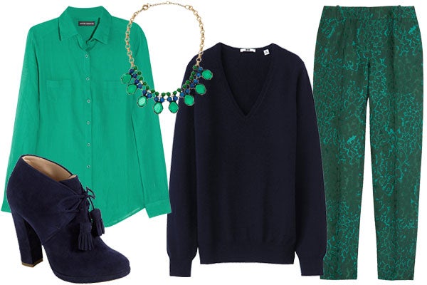
With 2013 just begun, we have a solid 365 (well, technically 362) days to test-drive any and all new, emerging trends to our heart's content. And the Pantone Color Of The Year, emerald green, is no exception. While the hue calls to mind cheery clovers and traditional tartan prints, arguably, it can be a crap-shoot. Do you really want to don such a rich green shade immediately following the holiday season? Will we look like we're about two months too early on the St. Patty's Day festivities? I say, not at all. 

outfit3


A rich jewel tone, emerald can be flattering for just about everyone regardless of skin tone, hair color, and most importantly, your personal style.


 "Lively. Radiant. Lush… A color of elegance and beauty                        

                        that enhances our sense of well-being, balance and harmony."


February 14, 2013

Get It: 50 Shades of Pink


South African Local Magazine: 
Get It (Potchefstroom/Klerksdorp/Parys)


February Issue 2013


Store: AK Bazaars (guy) & Olive Doore (girl)


Dress: Kobus Rautenbach Couture


Dress & Hat: Just4You Boutique

Dress & Hat: Just4You Boutique
Men Shirt: AK Bazaars

Shoes: Just4You Boutique


Skirt: Anel Botha Couture

Men Shirt: AK Bazaars
Skirt: Anel Botha Couture
Top: Models Own


Dress: Olive Doore Boutique


Photographer: Donovan Roets Photography
Stylist: Karla Bosch (me)


Happy Valentines Day!

Happy Valentines Day to all my 'lil Ka-La-La's, supporters, friends & familia!
May this day be full of LOVE LOVE & more LOVE...


February 11, 2013

KarlaCloset: NW Fashion Talk


What I wore to our NWSD event last year, North West Fashion Talk...
All Items came out of my own closet.

The stores I chose to represent that night was MR PRICE, KLINES & EDGARS! 

Earrings: Mr Price R49,99
Necklace: Klines R89,99
Arm: Klines R99,99
Ring: [Vintage buy] R79.99

Fake Leather Skirt: Edgars R89,99 (SALE)

Heels: Mr Price R159,99


With friend/designer Kobus Rautenbach!